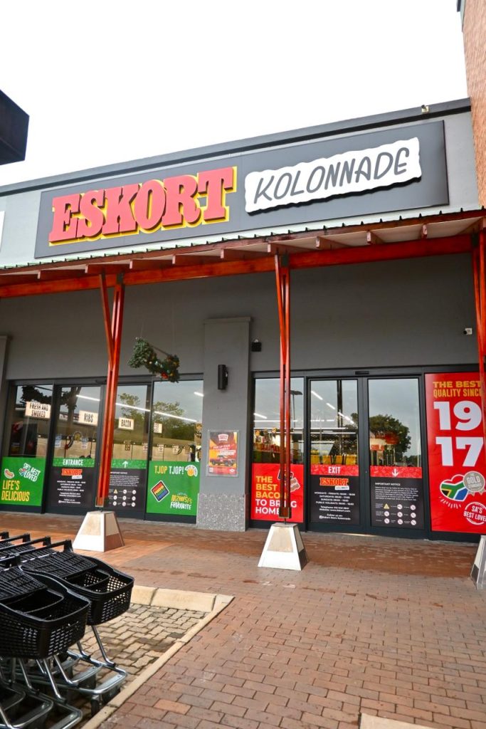
Eskort Store Kolonnade Now Open
Pretoria just can’t get enough of Eskort, and the feeling is mutual. We have opened our fifth store in the beautiful Jacaranda City, and we could...
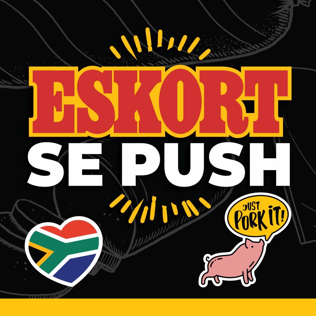
We have taken on a new look that was inspired by South Africa’s unique trading environments. The brand’s aim was to underpin the South African heritage in its new look and feel, as well as to speak to South Africans in their native tongues — using both a visual language and the written word, all while remaining true to the brand’s 103-year history.
MetropolitanRepublic’s design team, led by Liam Longland, relied on classic design principles and proven techniques to navigate the brand refresh journey, opening their hearts and minds to understand the relationship between Eskort and the people of Mzansi, and reflect it in the new corporate identity.
“Simply put, the brand essence is what led us to the brand identity. For generations, it’s been the bacon in our breakfast, the Russian in our kota, the polony in our padkos, and the banger in our mash,” said Longland.
“To come up with the new visual language, we took truly South Africa cues from the occasions at which its citizens come together to share a meal or snack, and rebranded Eskort with them all.”
Paul Warner, founder of MetropolitanRepublic, says “The brand refresh is a vital component of the new creative platform we’ve developed alongside the Eskort marketing team to revitalise the pork category.”
“Eskort could be described as an unsung hero in that it has never been an aggressive marketer but has nevertheless gained the trust and support of consumers from all walks of life to become a staple in the South African fridge,” adds Warner.
“With the new brand CI, we wanted to tap into a South African lexicon and modern-day culture to develop a fresh Eskort visual language that we can weave into our new creative platform,” says Warner.
“Longland and the team have done an exceptional job to deliver work that will ensure Eskort solidifies its rightful position in the hearts and minds of South African consumers,” concludes Warner.

Longland: “This is a friendly visual tagline that supports the big idea driving the campaign – that not all pork is the same. Eskort owns several valuable territories that set it aside from competitors.
“On the functionality side, there’s quality and safety; a superior taste profile; value-added products; and ownership of the entire supply chain from farm to fork. On an emotional level, there’s the fact that Eskort is a trusted brand and that it makes South Africa’s best-loved bacon and pork sausage.
“As such, Eskort is the obvious brand of choice because of the love South Africans have for it, not just as a pork brand but as a social glue. Something around which people gathered and celebrated.
“And so, this logo answers many questions. For example, ‘What tastes so good?’ ‘It’s Eskort.’ ‘Who has the best quality pork?’ ‘It’s Eskort’.”

Longland: “We wanted to use a font that was part of the South African landscape, so we researched signage across the length and breadth of the country, finally developing two bespoke fonts for the brand, Eskort Spaza and Eskort Padstal. The beauty of them is they can be reproduced digitally and in print, but still look as though they’ve been written by hand.”

Longland: “The palette is unashamedly based on the South African flag, but also uses the gold from the old CI. The look & feel leans heavily on bold colour usage. Eskort is – and should be known as – a truly patriotic heritage brand.”

Longland: “Here, using our display fonts, we want to communicate the brand’s diversity, whether we’re speaking about cultures or even product categories.”


Longland: “The historic illustrations give an old school and hand-drawn feel to the corporate identity, and highlight Eskort’s commitment to its heritage and way of work. For example, Eskort’s sausages – regarded as the most loved pork sausages in South Africa – have been made by one man, following the same recipe and same procedure, for 27 years.
“This series honours that dedication and commitment and speaks to the heritage of the brand. It conveys many elements in the Eskort world. When we see them, we feel at home and part of the brand. They create a visual literacy and reinforce our South Africanisms.”

Longland: “The layout design language is based on the old school concert posters. It translates into a tiled system that contains the different corporate identity elements – copy, photography, icon pattern, illustrations, badges, logo etc.
“The goal is to create a recognisable yet flexible system, similar to the Windows 8 grid system. More important tiles can be enlarged and shifted, whereas graphic elements (of less importance) can be reduced. We refer to it as our ‘shifty tyle system’.”

Longland: “These executions (above) replace the current ‘quality and freshness’ medal. Multilingual versions of the seal have been produced and will be used in the appropriate language executions. This makes the quality seal universally applicable; it means the same no matter the language.”

Longland: “We created a new quality assurance badge (pictured above) depicting a pig and the word SAFE over a globe. It communicates the global benchmarks that Eskort’s quality assurance practices meet while neatly summarising the four cornerstones of its quality assurance programme:

Longland: “These ‘factual stamps’ (above) convey any proven, research-based information, such as awards and nutrition.”

Longland: “We added a fourth layer to Eskort’s badges – what we call ‘fun and customisable’. These are just for fun and enhance brand tone. They’ll always be colloquial and tongue-in-cheek.”
Pretoria just can’t get enough of Eskort, and the feeling is mutual. We have opened our fifth store in the beautiful Jacaranda City, and we could...
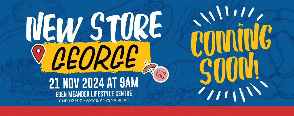
We're excited to announce the grand opening of our brand-new Eskort store in George! And we're not coming empty-handed – we have amazing instant...
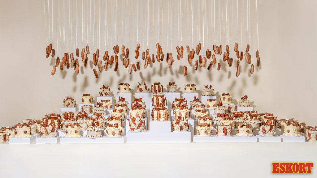
When you turn 107, you definitely deserve 107 cakes. But, we didn’t just settle for ordinary cakes. As South Africa’s leading antibiotic-free pork...
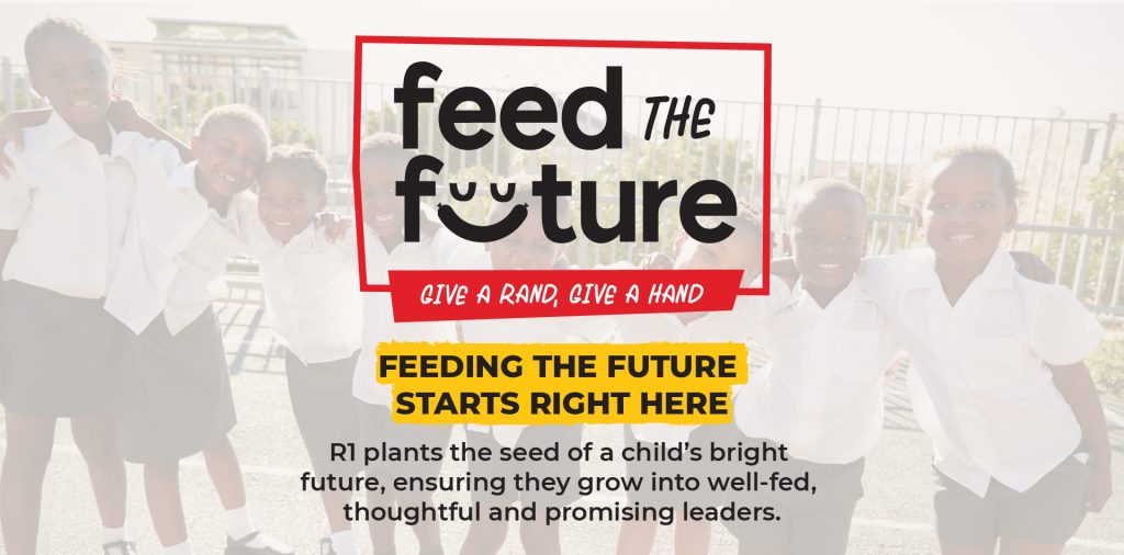
“Give A Rand, Give A Hand” is dedicated to solving the food crisis by feeding children in underprivileged communities surrounding Eskort stores....
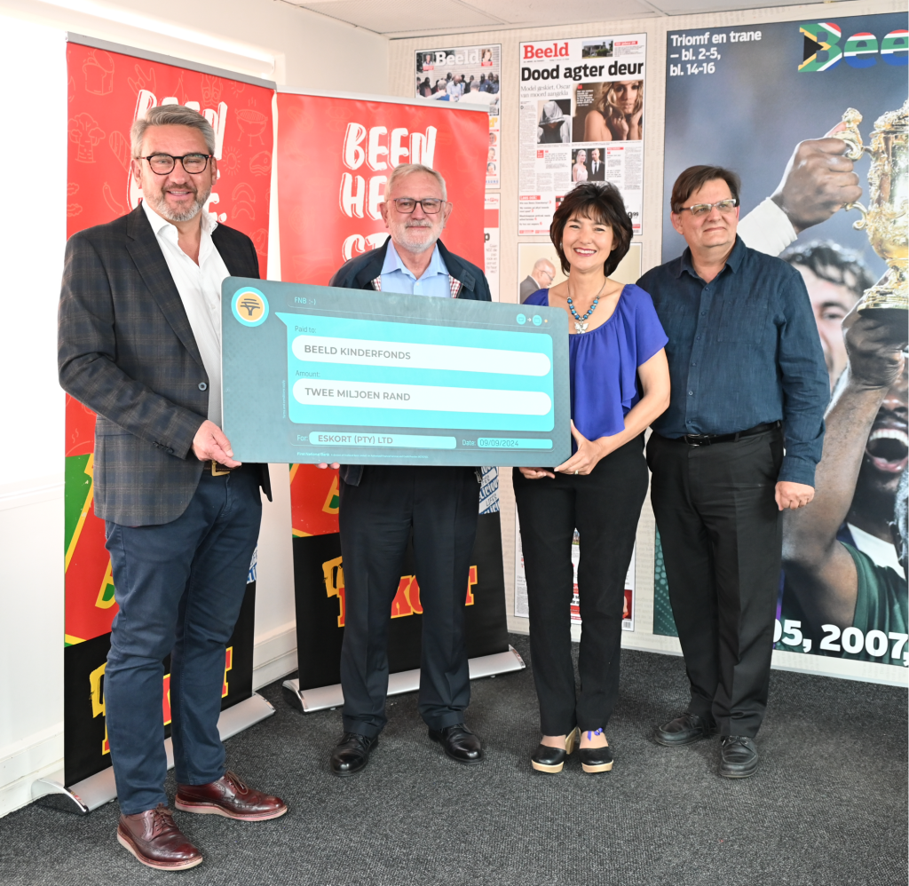
Eskort’s Liberi wine partnership raises R2m for underprivileged children The third collaboration between Eskort, Saronsberg Cellar and a leading...
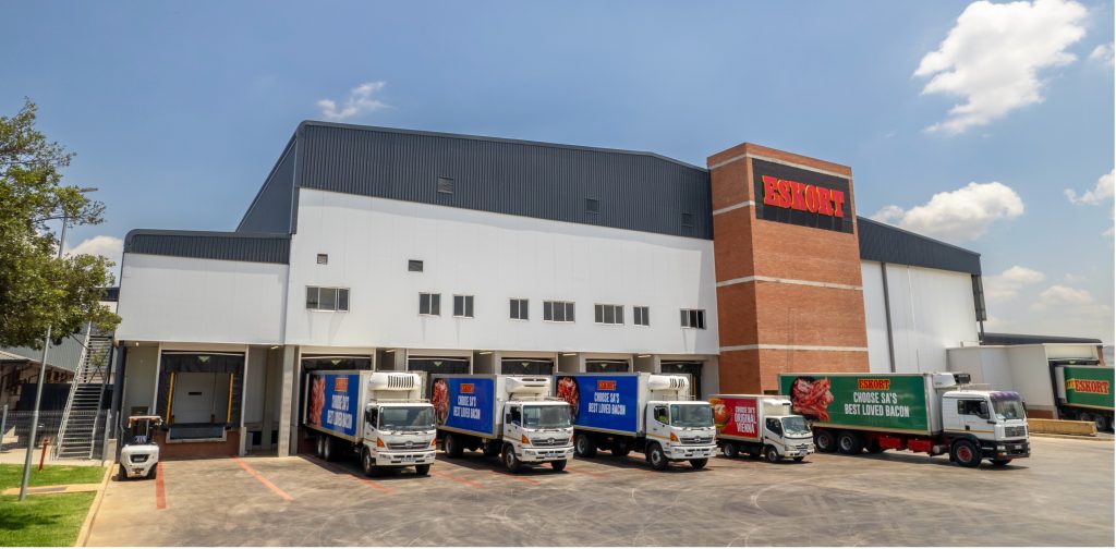
With the official launch of the Heidelberg Factory Extension in mid-February, Eskort, the top pork producer in South Africa, has increased its...
Small-town investment in Heidelberg drives high-tech efficiencies at South Africa’s pork leader Eskort, South Africa’s leading pork manufacturer,...
Power outages remain a significant challenge for hard-pressed South African households, particularly when it comes to providing a tasty, affordable...